Tim Jacobus
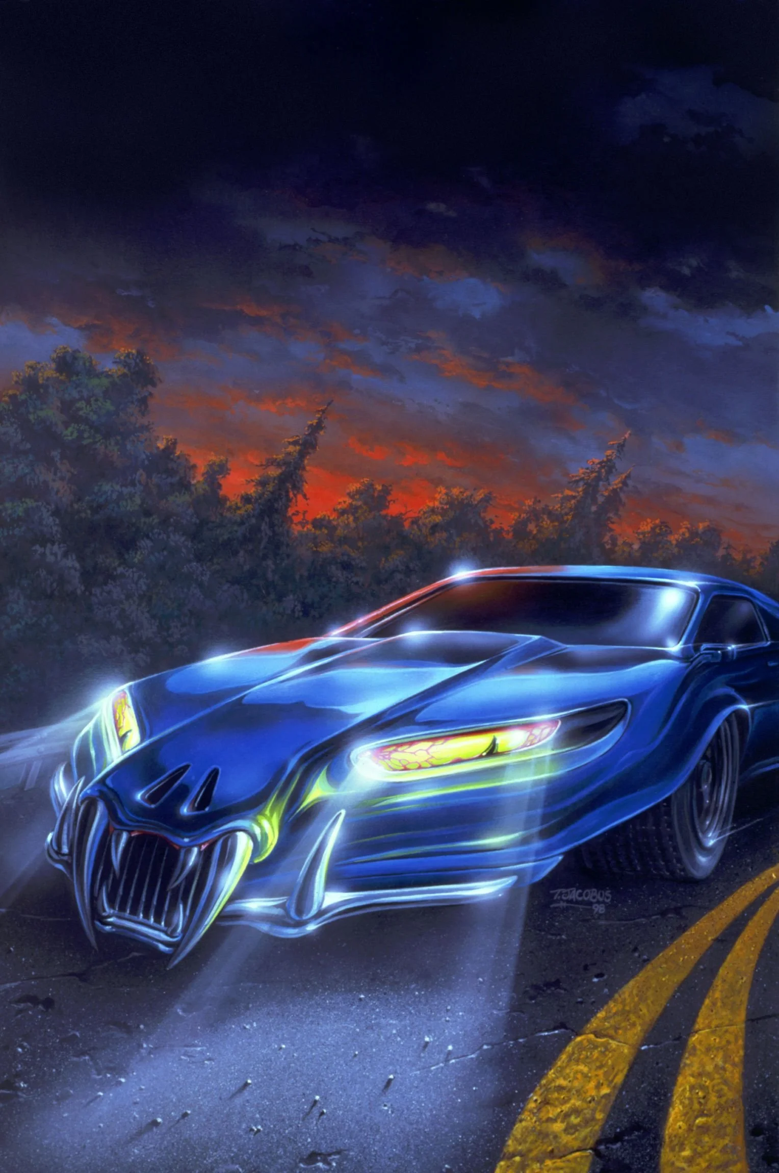
A golden tinge seeps from an old door, cracked open. A gang of purple reptiles loiter at the corner of a dimly lit phone box. Gooey creatures writhe across a field of wheatgrass, as giant moons float on the horizon.
Like many kids of the 90s and 00s, gazing upon the electric dreamscapes of Tim Jacobus ignites a whir of nostalgia, as well as a longing for those neon hues of my childhood. Browsing Tim’s work is like eating your way through a charcuterie board — his satisfyingly spooky illustrations have adorned the covers of over 60 Goosebumps novels — and each one is uniquely delicious.
Tim spent his early years airbrushing cars and collecting prog-rock albums, until he marched his way from New Jersey to Manhattan with some paint, one pair of Converse, and a dream. Luckily, several publishing houses caught on to his gift, and so the Goosebumps legacy was born.
Over 30 years have passed since the first Goosebumps book was published, and Tim still expresses an infectious gratitude for where his hard work has landed him. Through the rise of digital art, his workflow has steadily evolved — he remains confident in the future of creative technology. Tim’s dedication to world-building and the undying loyalty of (now-grown) Goosebumps fans continue to keep him occupied painting far-out vignettes in his New Jersey studio.
After seeing Goosebumps every year in my school’s Scholastic Book Fair, I was initially afraid of the books before picking one up. How did you manage the threshold of scariness for an audience of primary school kids?
It worked out nicely because I wasn't a horror fan. I was that kid who, if I went to the movies, would go out to call my mom and tell her to pick me up because the film was too scary. I have a softer touch already, and I think that helped me to put stuff out there that wasn't too edgy. Once I started to work with R.L. Stine (the author), I realized that not only were we trying to make it scary, but there was also a humor element to it. I knew that I should be a little bit scary, and if I could be funny as well, that was the way to go.
I think you managed that balance incredibly well. But I want to ask: Have you ever drawn a cover that was scrapped for being “too spooky”?
Nobody said specifically that something was too scary. Long before we got to the final painting, I presented three pencil sketches, and each one of them was different. The funny thing is, R.L. Stine wasn't involved with that process. It was discussed with the art directors and the editors privately.
I always knew that there were two rules. You could never show a kid getting hurt, and you could never show red blood. We could show monster blood everywhere. As long as the blood was green, we could go to town.
That’s amazing! I’ll have to go back and search for the monster blood. You’ve mentioned previously that you are not interested in scary things so much, despite your pioneering work in children’s horror. If you had to choose, what kind of subject matter is your favorite to illustrate and why?
When I first started, I thought I was going to do album covers. That was where my mind was during high school, when I was dreaming of doing at least some art for a living. My work was very fantasy-oriented, and I always leaned toward dreamlike environments. In other words, I wasn't trying to be ultra-realistic in anything I did. But what's cool is that the context of my work doesn't matter anymore. These days, everybody’s got an open mind— anything that I might put on an album cover could also be on a book, and so on.
I am curious to know more about your creative journey as an illustrator. Can you talk about some of the experiences, artists, and role models that shaped your work from the beginning?
Again, album covers were a huge thing when I was growing up. We all were more impressed with somebody's album collection than what kind of car they drove— your album collection gave you prestige. A main inspiration of mine was an illustrator called Roger Dean, who did all the album covers for the band Yes. I discovered him when I was 16, early in my ability to draw. In the beginning, I was drawing a lot of what I could see. He was the first guy to make me realize that no one cares if you can draw something perfectly. People want you to show them something new: something that doesn’t exist outside of your illustrations. You need to create other places for your audience to visit. Roger Dean planted that seed for me— I could conjure up places that don't exist, and then I could draw people, characters, or creatures in them to complete the mission.
Despite knowing that all your artwork for Goosebumps was done meticulously by hand, your airbrushed style bears a lot of resemblance to digital art. Could you elaborate on your thoughts about the illustration industry (along with most creative fields) becoming overwhelmingly digitized?
Back when I was doing the Goosebumps covers, they were acrylic paintings— digital art didn't exist for the regular guy. I found that using a combination of acrylic paints and airbrush worked best for me. I actually started out doing work on cars and motorcycle tanks, which is where I first picked up an airbrush. By the time I went to art school, I already knew how to use the airbrush, so I got pretty prolific with it. When digital art came along, my work happened to have a digital feel, which was interesting.
The transition from traditional to digital wasn't easy, but at least I knew that. Without having much experience, I could see what other people were doing digitally. Then it got to the point where all the book publishers told us, “The clock starts now. You all have two years.” They told us that they would not accept traditional art due to the speed of production with digital work. I promised myself that I could make it happen once I navigated all those stupid tools. Eventually, I figured out how to make all the new stuff look like the old stuff. I already had a style, and I didn't want to throw that all away. I worked very hard to get that back. And in the process, I realized there were things I could do digitally that I could never do traditionally.
Do you have a preference between analog and digital illustration?
They both have their pluses. They both have their minuses. When you're in production, though, you’re part of a whole system of people. If I went to produce a full-color acrylic illustration and handed it to my printer, he wouldn't know what to do with it anymore. So, my standard rule is this: if it's going into production, I work digitally— because everybody along the way won't know what to do otherwise. However, when I'm doing digital art, all of it still starts outside the computer. My pencil sketches are still on the desk. When I get my sketch nice and tight, I scan it and finish the color work inside Photoshop.
In 2003–2005, when digital tools became popular, there were lots of people claiming that was the death of art. That it was never going to be good again. Of course, that's not really what happened, you know? It just became different. In the last 12 months, AI has become a phenomenon, and the words are exactly the same: “Art is going to die. It's the end of the world and nothing's going to work like it used to.” But let's be real, you know? Is this the end of art? Probably not.
What are your thoughts on AI?
I play with ChatGPT. Back when social media didn't exist, I would drive to the library and get all the best books I could find on my subject matter. I bring that home and that would be my reference material. Now I can open an AI software and ask, “What's your idea on this?” It’s like having a collaborator with me. I've also seen that you can create “Tim Jacobus Goosebumps Art.”
That must be so strange— being able to generate your own style through a computer.
Yeah. It is so weird. There's a vast amount of people who have at least picked a book up and seen my art. That's incomprehensible to me. I'm happy that there's a half a dozen people in my neighborhood who've seen what I do. The idea that people know my art — and there's enough out there that people can recognize it — is a great compliment.
Do you have a favorite or most sentimental Goosebumps cover? If so, could you explain the story behind it?
I'm asked this often, and it's a thing that changes regularly. The ones that I like the best are the prompts I didn't know what to do with right away. I’ll reference Scarecrow Walks At Midnight. You already know it's a scarecrow in the field. But as time passed, R.L. started conjuring up crazier stuff. One that I always talk about is It Came From Beneath The Sink. At first, I was like, “Ooh, that's good.” Then he told me it was just a sponge. I like those best because they turned out great, but, initially, I was just shaking my head.
You were in a unique position with Scholastic, where your artwork had to “sell” each of R.L. Stine’s stories without becoming too repetitive. With over 60 book covers in your Goosebumps portfolio, I imagine this was not easy to achieve. How did you manage to keep each illustration fresh and captivating?
A lot of the credit goes to R.L. Stine— he was the one coming up with the theme. His imagination absolutely fueled my imagination. I've done somewhere between 115 and 120 Goosebumps covers. Warped perspective was something I tried to utilize with a lot of them. If the scene was set in a kitchen, the counter was arched— I’d bend what would normally be straight lines in a photograph. I wanted my work to be just a little bit off, so even at the age of ten, kids knew that something wasn’t right. The use of color became a huge thing. I spent a lot of time trying my best not to repeat any of the color combinations that I used on previous covers.
I think when you're a younger kid in primary school, you’re judging books by the covers. That's what is getting you to pick it up. That was the key to R.L. and my success: I got to get you to pick it up, but once you opened the book, it was on him to keep you hooked all the way through. If we both do our job, when you're done with the book, you're looking back again to get another one.
What does your life look like outside of the Goosebumps fame? I’d love to hear about the work you’ve done for different clients, or for yourself.
I’ve started to do a little bit of everything. Once digital art had taken over, I did a lot more commercial and advertising work. But now, all the people who were Goosebumps fans in the 90s are grown-ups. They play in bands, they're art directors, they work for ski companies. People who used to read the books are now reaching out to me when they need me. All my emails start the same way: “Tim, I used to read Goosebumps as a kid. Now I’m working on this project, and I want you to do some art for me that looks like Goosebumps.” I get many of those messages in the course of a week.
What do you see being created today that excites you?
When I got into the business, people were most likely going to do something print-oriented. Even if I thought about making a movie, it was pretty far-fetched with the tools that were available to us. As time kept moving forward, one could pick up a cheap camera and produce something on their own without a big budget. The tools only got better, and now you can collaborate with somebody who's on the other side of the world. Every day I read about a new video editing tool or AI software popping up. I don't know where the end is, but it's so cool that there is an infinite way for people to be creative right now.
Not to mention, there's a new wave of people who have creative minds and great ideas. Just because they can't draw something with a pencil, doesn't mean they’re thrown out of the market. It is way more accessible to get involved in the art world. And people being creative— there's no downside to that.
This interview wouldn’t be complete If I didn’t ask— What scares you the most?
I got some surgery earlier in the week because I was having problems with my eyes. It's all okay now, but I'm old enough to see that I'm in the fourth quarter of my football game. The fact that things are finite. Not that it's scary… Life just becomes more imperative.
Interview by RÉKA GÖTZ
What to read next


