Uranorms
It’s amazing how something as overlooked as a font can transport you back to a different era of time. Before talks of the metaverse, crypto currencies, and AI voice analytics at border control, cartoonists and writers emerged from the Y2K doomsday hopeful and optimistic about the adventures that could be had in the virtual dimension. Characters surfing binary codes, early 3D animation, and the remnants of 90’s street fashion filled the public consciousness with the promise of inhabiting our desktop monitors – and digital artist URANORMS is reminding us of the techno optimism we once took for granted.
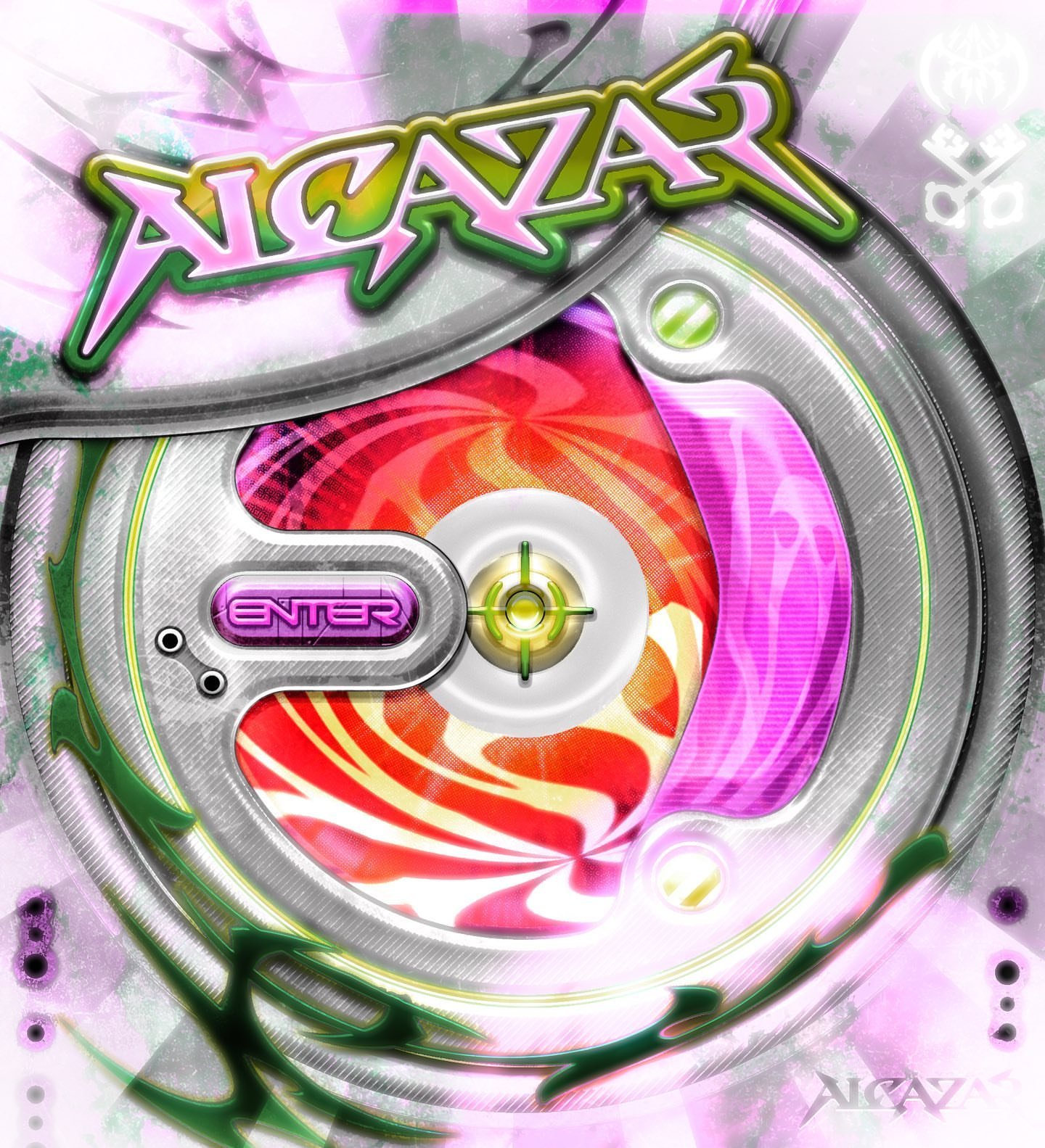
Using mixed media designs and layouts, Maicha translates these vintage aesthetics onto our modern day virtual landscape, equipped with new technologies and a distinct personal style that play into our 2000’s nostalgia, while shaping the graphics we might finally be able to inhabit. Taking inspiration from video games, fashion, and layouts of the past, Maicha is a creative at the forefront of what we can only hope to see evolve over the next decade of digital exploration. With her ever-evolving art direction, the boundaries of her work are growing exponentially –influenced by the futurist aesthetics and refined technology which can now finally be actualized.
Hey Maicha! How are you doing?
Hi, I’m doing good!
Amazing to hear! I feel like your works are this elevated nostalgia – you present layouts and details which bring us back to a very specific time in graphic design, but give it a new level of sophistication and dynamism thanks to modern software. What inspired you to start developing on this aesthetic and, on a more personal note, is there any video game from your past that you feel really helped to steer you in this direction?
When I was little, I used to watch a French cartoon called Code Lyoko, where 5 kids from the Paris suburbs used to go on missions in a virtual world, to fight an evil force called Xana. What I loved the most about this show, was how they mixed traditional 2D animation (in the “real” world), and 3D animation (in the virtual world), which was a concept I have never seen before. This show really stuck with me, and is probably the main reason why my art has such a strong 2000’s cyber vibe. I’m surprisingly not a huge gamer, but one game that I really loved was Mirror’s Edge. I was obsessed with how sleek the environment looked in this game.
I’d never heard of Code Lyoko before, but the art direction seems so sick! Especially given the current rise in futurism and cyber punk aesthetics. I also have to admire the typography!! The way that it adds a crazy amount of detail and atmosphere to a piece is insane. Your logos compose a large portion of your works – often as commissions. How do you find the experience of manipulating a name to fit somebody else’s brand, while also embedding your own personal style within it? Naturally that is a big part of how graphic design works, but especially with an aesthetic as distinct as yours being sought after, how do you approach translating another entity through your lens?
I only started focusing on typography as the main element of my work a few months ago (I used to mostly focus on making intricate layouts). I used to only make Y2K logos, and it got very boring. Then I decided I wanted to get better at typography, and I started experimenting with different styles and it worked out great for me! This is what really helped me create more interesting logos/types that fit with my clients’ brands, while still being true to myself and what I like. I think the key here is to not fixate on the idea of “personal style”, and to view each logo commission as a new exploration, where you get a chance to work with someone totally new, and get to create something special with them. Also, I have to give credit to my clients, who tend to be really good at giving directions, which push me to get better each time.
It’s kind of like an ever expanding outlet for your own craft, as well as this collaborative project. I think this is probably the best way to go about it, as you can also pick up on skills from commissions and use them in your own works! It’s also so refreshing to see bright neons used in designs – especially considering the minimalist turn that graphics have taken over the last decade. Whereas logos can sometimes float in the middle of the piece, it truly feels like every component of your work is active within the piece; they cast shadows, they illuminate parts of the design. What is important to you when it comes to colors and spatiality in the composition of your designs?
As you said, every component of my work is active within a piece. I really tend to view each image I create as a whole environment. I don’t think in terms of “background”, “foreground”, and take a more intuitive approach. I don’t care so much about respecting design rules. They are useful, but can also limit our ability to just create things. I don’t want to overthink what I do. Sometimes you just want to make a piece where a word is levitating and light is bursting out of its letters, and that’s fine! When it comes to colors, my process is super intuitive as well. I just go with whatever colors would look nice together (I guess I have an eye for matching colors together?).
You definitely have an eye for it! When you have the talent and creativity inherently within you, I feel like it’s more about trusting your own instincts than trying to create something in a specific way. The part that makes it look amazing is the part of it that comes from you. As a digital artist, it must be so interesting to see your commissions transformed into merchandise. I love the way that your logo for Borklyn Zoo was turned into a rug, for example. What has your experience been like as a creator to see your works transformed and utilized by those who commission projects from you?
Seeing my work on real life objects always feels surreal! I’m so caught up in making digital art, that sometimes I forget that design can also take tangible forms. Some clients have made clothes, CD and cassette releases out of my cover artworks. It’s just crazy to me, and I definitely want to do more big projects that’ll end up in a physical form.
I think we all definitely want to see that! I know you also do some character designs which are so cute! How do you feel, in terms of creativity, this endeavor differs from your other graphics? What do you hope these little avatars embody in relation to your own self expression?
Those characters are close to my heart. I used to draw a lot when I was younger, but then I got into art school and basically stopped drawing (kinda paradoxical). Making characters is a way for me to get back into drawing, while also exploring more fashion-related work. I would love to come out with clothing in the future, so I’m practicing drawing and imagining clothes. Also, I wanted to make characters because it’s really fun for me, and would like to work on more character design commissions.
So many people I know went to art school definitely experienced the same thing – but illustration gives you the opportunity to pursue so many other designs that could be such amazing endeavors! I’ll definitely be looking out for your clothing line in the future.
Thank you so much for answering my questions! I can’t wait to see what else you come out with in the future <3. I’ve also seen you do joint-projects with other artists – as my final question, I was wondering what your dream commission or collaboration would be? Where would you love to see your own designs displayed?
My dream commission would be a large scale brand identity, where I get to create everything from the logo to the packaging, the website etc. Long term projects in general are an opportunity to really connect with the client, so they are the best kind of commissions. I hope I’ll be able to see my work on posters or even billboards: something that’s outside in a public space!
Thank you for having me and for these great questions :)
interview ALIA AYOUBI
What to read next


