
Typelab

Central to Typelab is collaboration and experimental design with the use of 3D, videography, texture, conceptual ideas and graphic design. Launched by French typographer and art director Floriane Rousselot in 2018, Typelab is a place for innovative design created by up and coming designers to showcase their typefaces. Floriane wanted to bring together the work made by her collective of designer friends which grew into a larger collective of young designers from around the world. Recently Typelab launched their digital exhibition that incorporates 3D design and videography which contextualises each typeface in the space collection. The video itself takes the viewer on a journey through a euphoric, futuristic world. Floriane talks to Coeval about Typelab and the digital exhibition as well as her concepts and design processes.
How and when did Typelab begin?
Typelab was launched in 2018. I wanted to offer a place where my designer friends and I could present our type design work. Then I decided to extend it to young designers from all around the world and the Territory Collection was created. The idea then was to propose a digital place of experimentation and a typographic catalogue which showcases contemporary typefaces. It is also now a place for young designers to sell their typefaces but also a support for them through the whole process of selling typefaces.
What sorts of clients do you cater to?
The idea is to highlight the power of experimental typefaces and what they can transmit. So Typelab’s catalogue is turned through independent designers, but also small studios, bigger agencies, artists, clients established in the cultural field mainly but also brands. We would love to establish new perennial collaborations. At the moment one of the new aspects we’d like to develop – at the same time as our relationships with designers and clients – would be to rethink the typographic collections and create bespoke collections in collaboration with artists or brands. The idea would be to rethink the typography in its entirety, not only as a graphic element anymore but as an essential part of a creative process. A unique piece to broadcast an imaginary or a strong message in the same level as a piece in a brand's collection/artists collection.


You work with a selection of young designers in order to produce innovative typefaces, how important is collaboration to Typelab?
Collaboration lies at the centre of Typelab. Since the first collection this is the idea, and Typelab’s purpose is also creating a community of designers to simplify collaboration. From the collections to the web design and now with digital exhibition and our digital communication, each aspect is a collaboration. It is important in our process to engage each aspect in a collaborative way and working with people from different styles. It is essential to go out from our comfort zone and be challenged by innovative ideas and proposals. It is always an intriguing, bold, hybrid creation. Also the first willingness was to help young designers showcase their work, so collaboration in those different aspects with independents designers is supporting them and highlighting them to in a way.


What inspiration do you draw from to create the names of the typefaces, e.g. ‘Lapicide’ and ‘Ornamentum’?
Typelab does not choose the names of most of the typefaces, only designers do, as the typefaces are their creations. Emilie Vizcano, designer of Lapicide, explained she was inspired by the history to find the name of Lapicpide, from the stone engraving technique, Lapicide is the name given to engravers. Hugo Jourdan, designer of Ornamentum, explained Ornamentum is the translation of Ornament in Latin, as his typeface is creates sort of modular ornaments, he based the name on the graphic’ aspect of his typeface and the kind of visual game which is created when using Ornamentum.
Do you have a favourite typeface and why?
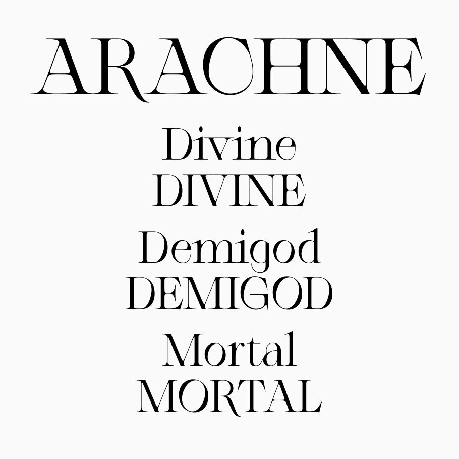
Each typeface has its own story and specific aspect, each one is the result of a smart experimentation and bold graphic shapes. All of them are amazing. At the moment our favourite ones are Arachne and MIU MIU as we are using them in our digital communication and this is a perfect mix between strength and delicate but incisive details.
How are the typefaces created, from initial design to outcome?
Depending on each typeface and each designer. Regarding typefaces, most of the time I personally designed the first shape/step which are based on visuals I find out on the streets, from a logo to a letter or a number or just a graphic element. The concept depends on a story, technical aspect or imagery which I think deserve to be highlighted. A lot of visual researches and then creating the firsts shapes which most of the time, personally, are not really pretty because the shapes are not harmonious yet — but working from mistakes to create something different from the initial idea is always interesting — and then letter after letter the whole result need to fit together. As the same way as a collection, each piece needs coherence, each one is essential and have to be pushed in a veritable paroxysm. Each letter is a part of a collection in a certain way, everything needs to be perfect in the end, even if sometimes the concept is to create a typeface which is experimental and so there’s some liberties regarding imperfection or illegibility, but it needs to be perfect in its imperfection. Each detail needs to be designed precisely and meticulously but also the spaces between shapes and between each letter so in its entirety there is a real coherence.

Typelab also experiments with a three-dimensional aspect, videography and sound which is shown in the digital exhibition. What influenced the use of these alternative mediums?
I really wanted to highlight and present typefaces in a new way. Most of the time type designers are creating print specimens in order to present their entire glyphs and typeface and highlight its potential. This is how we are presenting typefaces for centuries now, with the printing. Then digital emerged, and typography is still evolving. 3D and digital are the new medium in design and as a place of experimentation. Typelab was a good place to highlight typefaces in a fresh way, following the digital era. Digital age is driving designers through new initiatives and possibilities, so why not highlight typefaces through 3D, in order to show what the possibilities of creation are with our typefaces, how to exploit their potential and show their details in a new perspective. We must not forget print in graphic design and typography area, but we can open the doors to digital and explore new concepts. Plus 3D is a means of pushing forward the imagination, and be able to create a whole unique world like the digital exhibition. An opportunity to represent each typeface in its specific world and videography and sound is essential to show people an immersive project. Typography is no longer letters on a piece of paper, it is including sensitive parts, textures, concept and graphic design.

courtesy TYPELAB
typefaces @floriane.rousselot, @eonhardlaupichler, @josehoudini.es, @hugojourdan, @emilievizcano, @sophiabrinkgerd, @cs__laura, @fabioflorez_
art direction @sx_steffen_bew
cgi @sx_maxi_milane, @edgar_koop, @jonas_stadter, @sx_steffen_bew
sound @philippbulk
interview GABY MAWSON
What to read next


