Katherine Frazer
Imagine living in a house with all the walls adorned with unique paintings crafted by your favorite artists. If you had the chance, would you settle for bland and impersonal stock images, or decorate your home with unique pieces reflecting your interiority? That’s what the internet is: a landscape that users inhabit every day, a place where to spill fears, affection, anxieties; something every user should design for itself, refusing to accept a pre-made option designed by corporations.
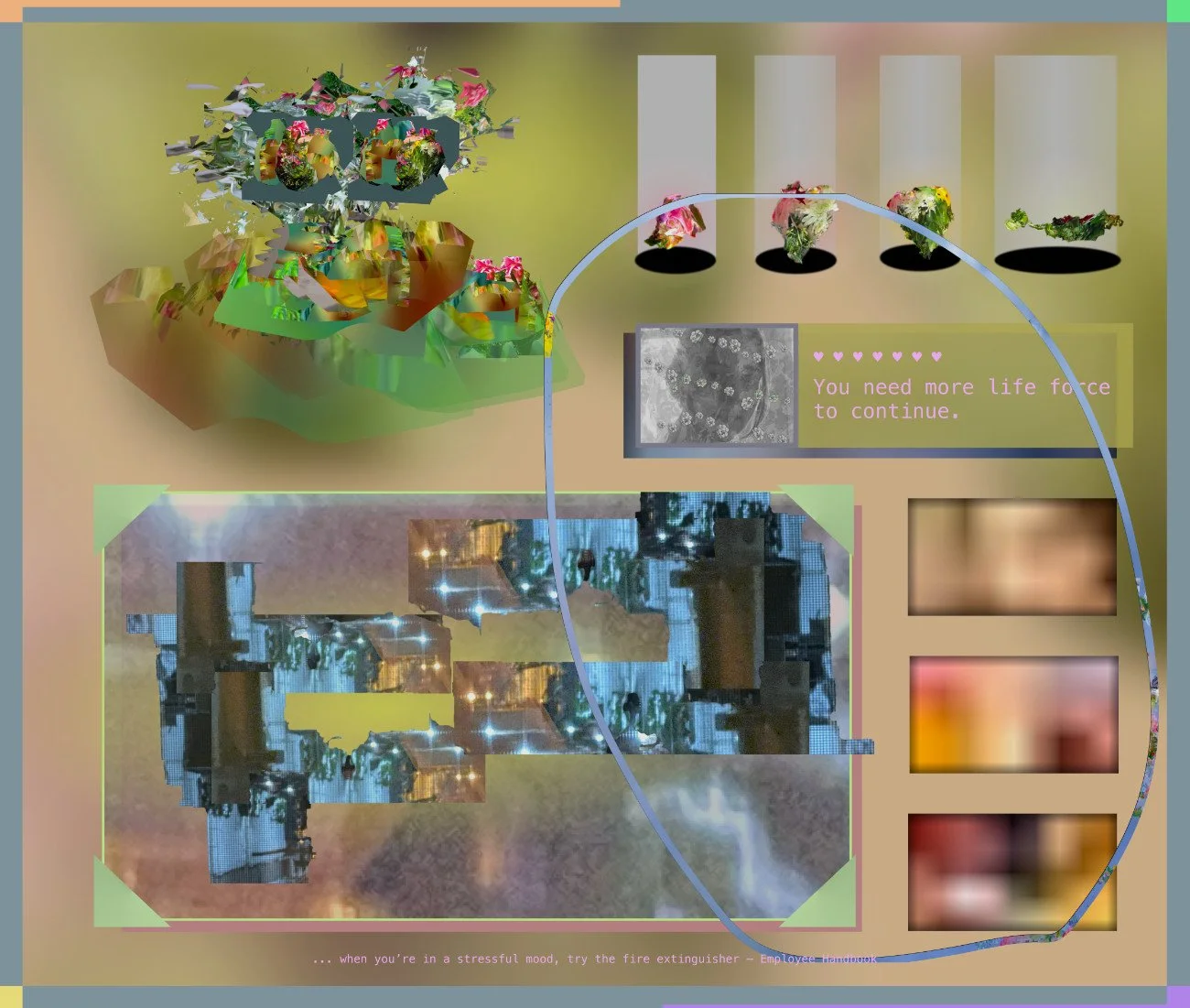
Working as a software application designer, Brooklyn-based artist Katherine Frazer subverts everyday web interfaces to show the importance of the web’s malleability; revealing how the digital realm can be a mean of self-expression, Frazer’s body of work is situated in a very long tradition of net-artists - such as Olia Lalina or Cory Arcangel - reflecting on the web’s ontological characteristics such as the fragmenting of time, the tension between permanency, dissolution and stillness, and the idea of the internet being a ground for counterculture.
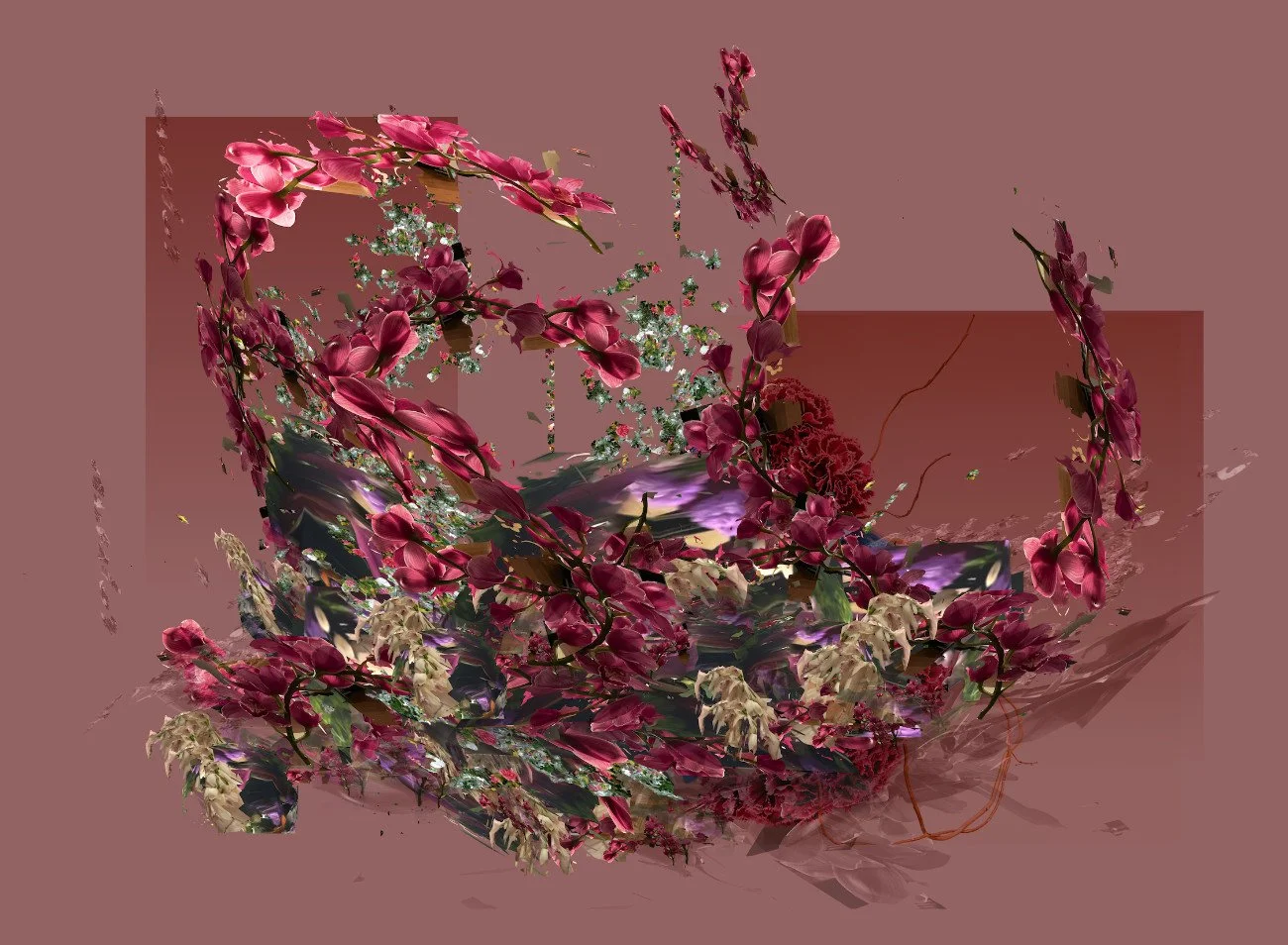
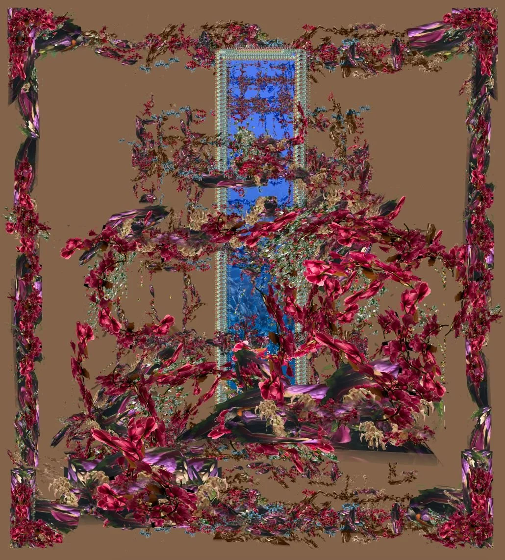
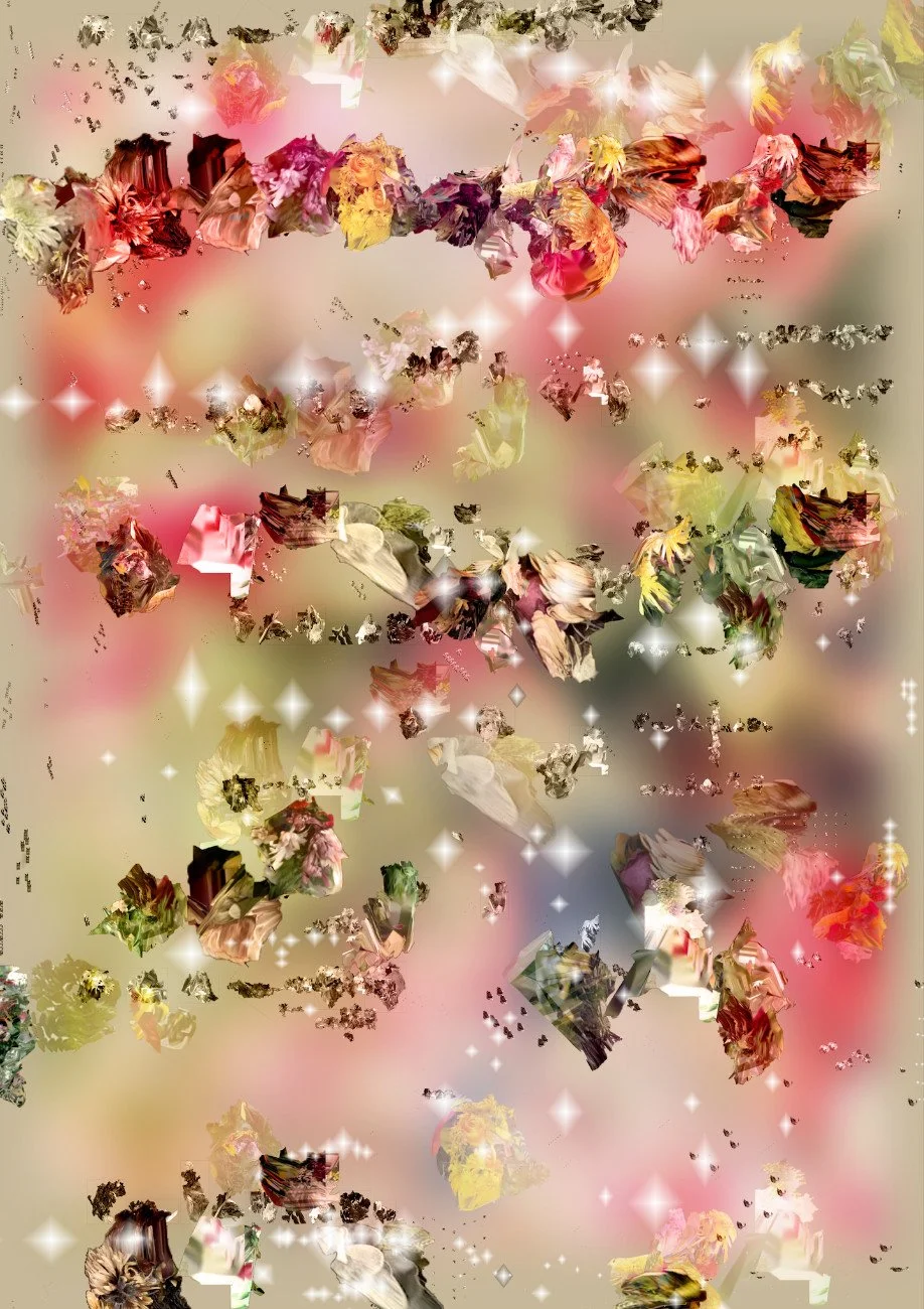
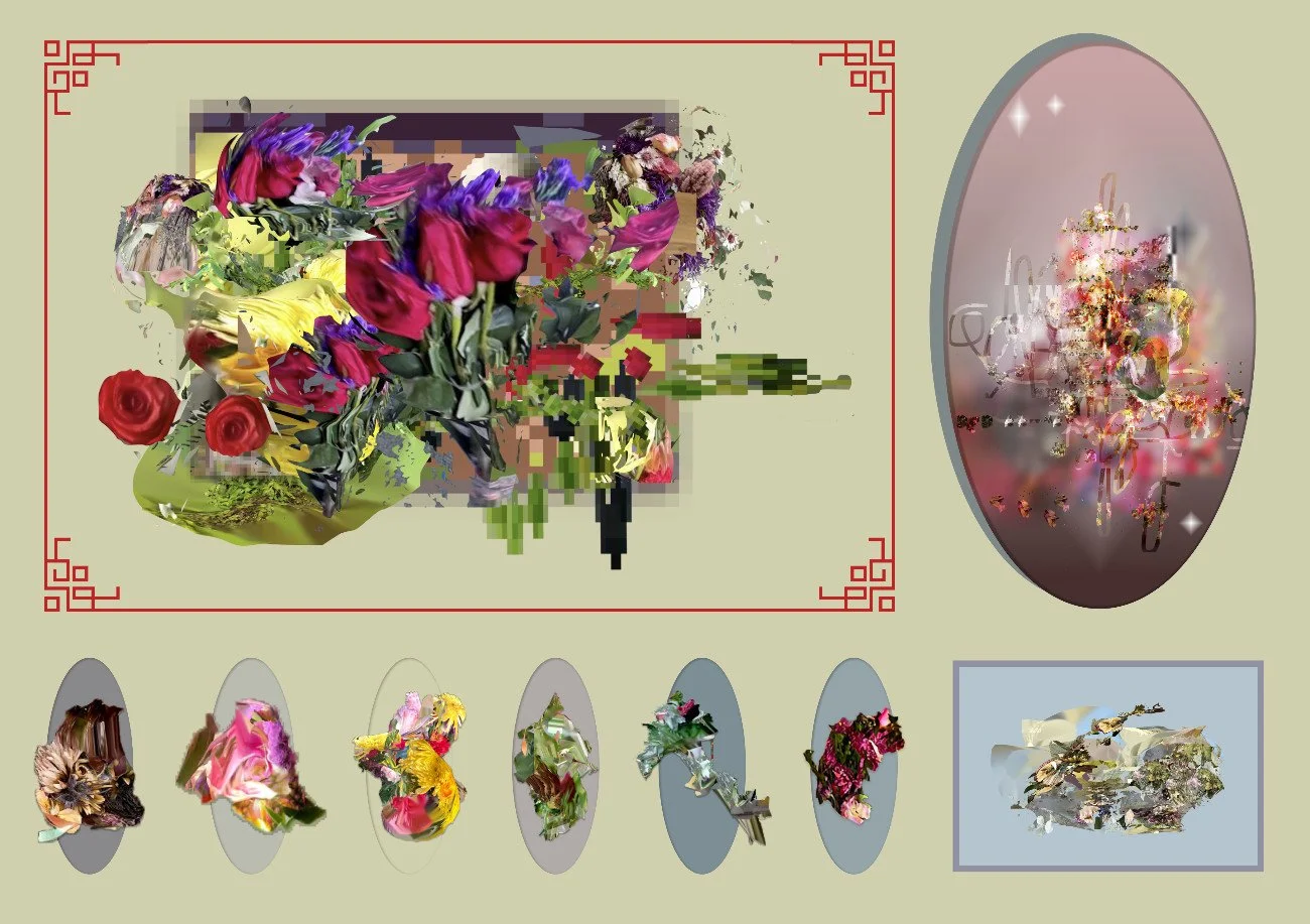
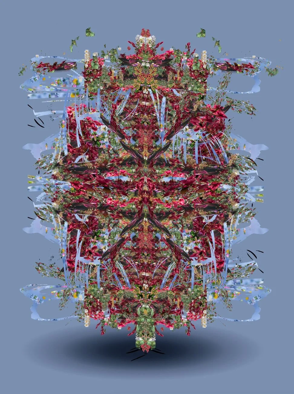
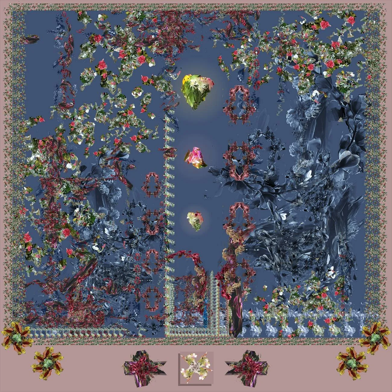
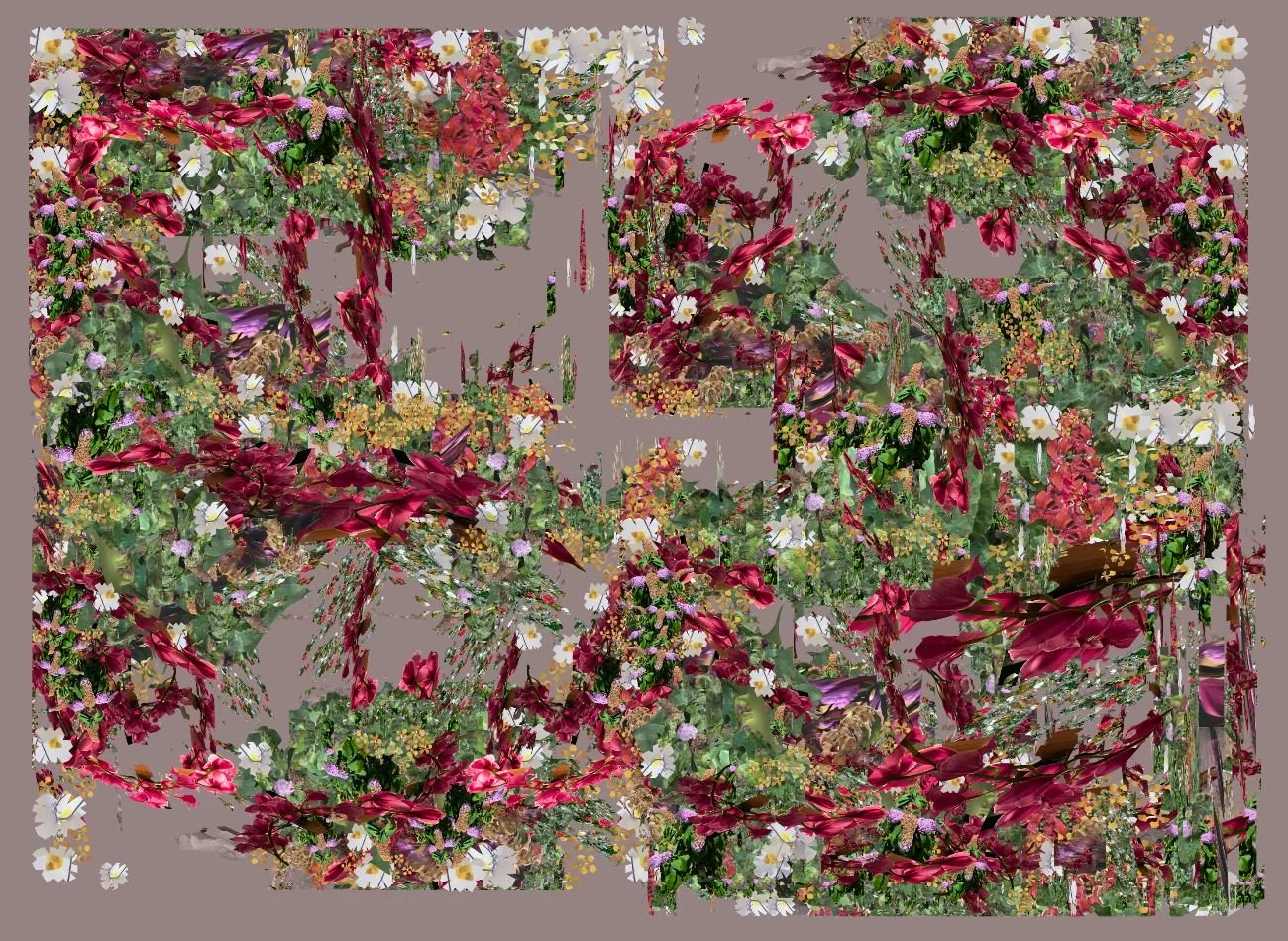
From interactive paintings to wallpapers mimicking Ikebana flowers compositions, Frazer’s digital art carries the poignant political discourse focused on not narrowing one’s scope of action in movements prefigured by somebody else, to not follow the existing rules of an environment all users could, should and must be the Architects of.
Hi Katherine! The promises of Web 3.0 are making us wish for a decentralized internet and making us discover practical ways to subvert the interfaces we’ve become accustomed to. Because of that, your work is very far-sighted, and obviously very political. How do you think we can educate ourselves to have an understanding of the control interfaces hold on us? How can we not feel trapped in these interfaces made by corporations?
Asking yourself simple questions - and following where they may lead - has been really rewarding for me. I often feel self-conscious about my lack of grand ideas or scope I’m trying to create within but working small, and thinking small, has lowered the amount of preconceived notions I have about something, and opened me up to surprises I think I would have taken for granted otherwise.
I don’t want to be prescriptive with my advice, but asking contrarian questions like “what would life be like without this app?”, “what happens if I only use raster assets in a vector drawing tool?”, “what if the amount of time it took to load a painting in Figma was actually the work, rather than the painting?”, etc. This probably has investigative paths and end points that differ for each person. Ironically, I think starting with a fairly dumb question can provide some distance to be more objectively critical of something.
Your experience as a software designer for Figma and Keynote definitely makes you one of the few people who can really look at and react to the whole matter from the inside. What did you find out working on the design of these softwares, and how did that change your vision? What is one thing that someone who uses them without seeing what’s behind should know?
After living, breathing and working in a program I’m designing in (like designing Figma), I’m always hungry for new perspectives. Software design often isn’t that creative, and it’s encouraged to fall into certain patterns and comply to system standards so that users have a consistent experience end to end. This doesn’t help someone like me, who’s easily bored, to be engaged. I wanted to remind myself that there is new even in the old. It’s a mindset that requires humble curiosity. I often fail at it, but that’s what I’m going for. I want to be able to engage with something with new eyes all the time, so that I continue learning and growing forever.
Your work reflects on the virtual world as an environment we inhabit: our habitats define who we are, how we move in a landscape, how we relate to ourselves and with each other. It is important that we not only live in "aseptic" houses, but that we embellish them and discover the possibilities of interior design which we can be the creators of. How did the parallel between flower compositions and software design first start for you?
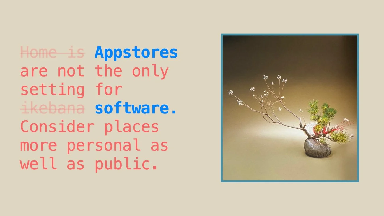
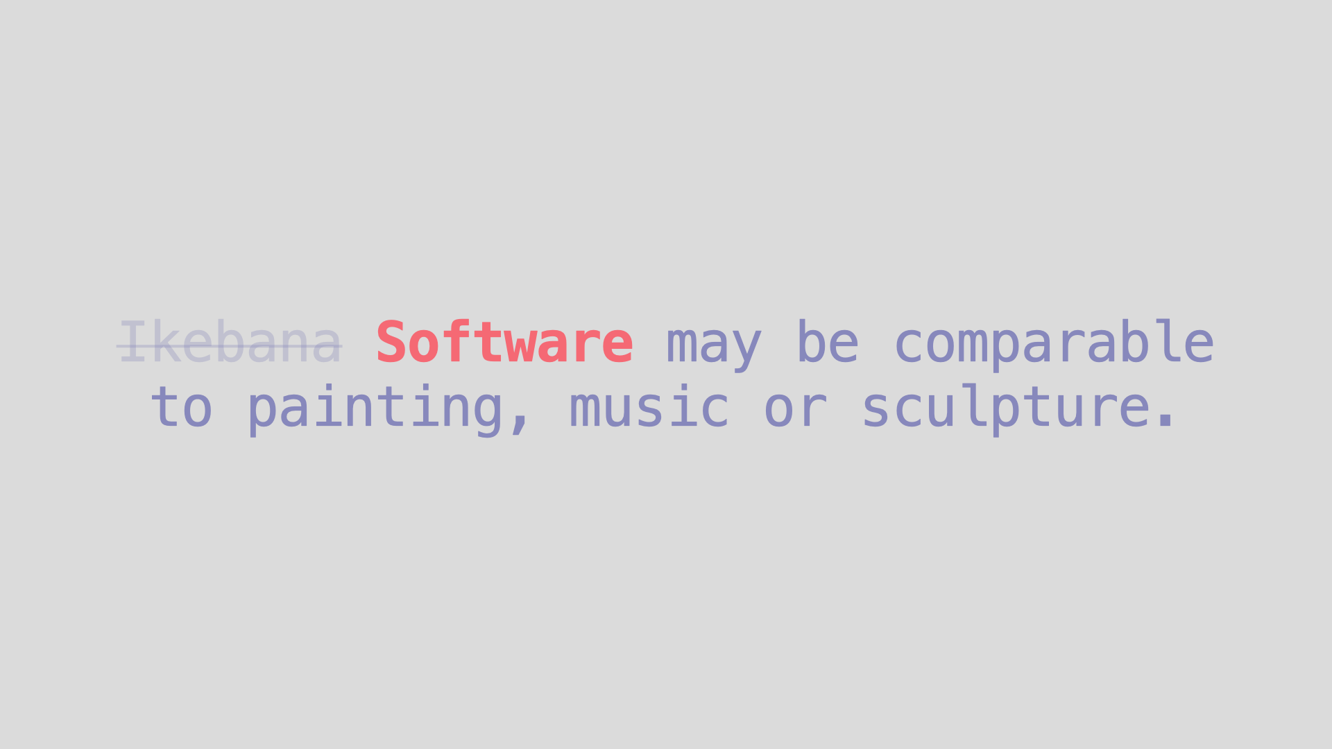
I started thinking more about the natural world and computers when I read Laurel Schwulst’s My website is a shifting house next to a river of knowledge. What could yours be?. It remained in the back of my mind, but those thoughts didn’t really emerge into any artifact until 2019, when I was asked to give a short talk on something I was knowledgeable about. Everyone suggested I talk about ikebana, since I had been studying it for a couple of years at that point, but I felt like an imposter. I was, and still am, a beginner. I wanted to combine that unique interest with something that I actually was knowledgeable about, which was software. I found The 50 Principles of Sogetsu, written by Sofu Teshigahara, and realized that those principles were applicable to any creative practice, so I adapted them to be a talk titled Ikebana Tips for Software Design.
Do you think counterculture can come from places such as Instagram? Do you think that this subversion could and should start from the old familiar interfaces we inhabit everyday?
I think counterculture can be achieved anywhere. Counterculture acknowledges the mainstream and subverts it, so it makes sense to me that counterculture could emerge on Instagram, using the platform for unintended purposes or driving agendas that the platform wouldn’t necessarily endorse. I think counterculture usually emerges from the bottom-up where a small group of likeminded people get together and act as a unit against an institutional force, but your question makes me wonder if counterculture could be top-down, where you plan the subversion ahead of time in a thoughtful and deliberate way.
I guess I am trying to do that by thinking of ways I can break the purposes of software programs, but in terms of countercultural movements, I think those need to happen from the bottom-up to have credibility and authenticity.
A common theme in Net-art - and in your work - is a reflection on temporality: the juxtaposition of vulnerability and decayment vs. stillness and endless scrolling. In the virtual realm, temporality can be shattered and re-defined, and brief or transient moments can be crystallized and become perpetual. Your work with Fruit Videos is very interesting in this sense. Can you tell us more about the process and about how the videos dialogue with your body of work?
Digital artifacts are simultaneously around forever and gone in an instant.
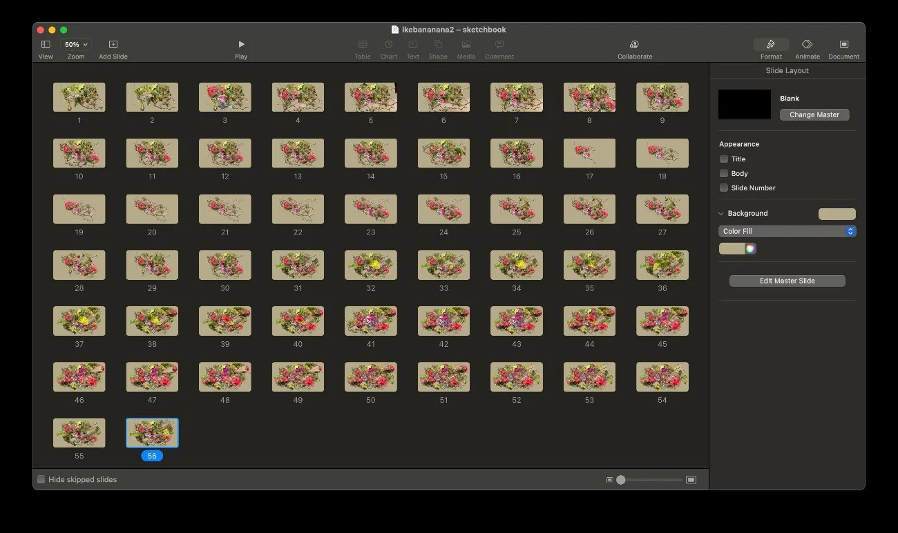
The fruit videos I made tried to make these juxtapositions more prominent. The videos are capturing a moment in time, where I’m a certain age, in a certain location, interacting with organic matter… but also on the blockchain, which is “forever”. It also felt like record keeping, where I can say I’ve been somewhere online. My desktop wallpapers are in a similar vein. They depict flowers decaying over the course of 24 hours on your computer’s desktop. I was trying to emulate the flowers I’d see wilt on the dining table throughout the week. It felt like such a uniquely “IRL” experience, because a static png of a flower will never change. My emulation via these wallpapers became it’s own thing that falls short of the IRL experience, but the tension that resulted from it is very interesting to me.
If you can and want, tell us about the next projects you are or you’ll be working on!
I try to underpromise and overdeliver! So, let’s say nothing for now, and maybe we can all be happily surprised later. ^_~
courtesy of KATHERINE FRAZER
interview by ARIANNA CASERTA
What to read next
