Lexie Smith
Lexie Smith is an artist, baker, and writer based in New York and the mind behind Today’s Neus. Lexie’s work in each domain often intersects with one another, creating a unique set of multidisciplinary work. Smith’s work is often delivered in a minimalist, cubist-like style that breaks any sense of categorization. We talked to the artist regarding her motives and vision for Today’s Neus.
How did "Today's News" come about?
Today’s Neus was born during a blizzard this past winter. I’d been inside drawing all day and realized that everything I was making was visually reminiscent of the state of the world outside my window. I wasn’t really happy with any of the images I was making, though. They were falling flat. Then my boyfriend mentioned a news story about an earthquake in Alaska, and while he was explaining it I typed out the headline and slapped it across my drawing in Photoshop. Instantly, I cared about the piece. It felt important and relevant and less self-indulgent. I started making a new one everyday for the next week and realized I was dramatically more engaged in the news as a result, and simultaneously pushing myself as a designer. So I challenged myself to make a new image daily for as long as my schedule would allow it. I made it a couple months doing these daily illustrations (exhausted but proud!), but unfortunately other obligations have been sucking my time away lately. Design is very therapeutic for me, but not easy, so the images take me a long time to make. I do it whenever I can.
Do you see your pieces for "Today's News" in a newspaper or in a gallery space?
My initial vision was to consolidate the images into a book at the end of a year, to tell the chronological story of the time that had passed in an unusual way, and to show “news” as a less fleeting genre. But because the images use print design as their ultimate inspiration, I see them printed in any capacity- larger scale screenprints or risographs in a gallery space would be great, though not totally necessary. For a time I was envisioning a show at the end of every month that displayed the previous 30 days of news. Time doesn’t really allow for such luxuries though!
How do you decide which headline to cover in "Today's News"?
I struggle with whether to use the platform to display lesser known stories or to further highlight the popular lightning rod headlines. It’s been an interesting couple of months to get into this project in that respect, as the election tends to overwhelm any and all news stories. I prefer the words or sentiment to have a poetic quality if possible, and to not only tell the stories of the tragic, soul crushing variety. But the world today makes that pretty difficult. Sometimes I’m reading through the news and an unlikely story will instantly evoke an image in my mind, and I know I have to present that one.
In your works in "Today's News" the typography in itself is an art piece, especially with how it interacts with space—why add images to the headlines?Are they related to the context of the headlines?
The images are related to the context of the headlines, though sometimes it takes me many permutations to get to the final choice, which can end up as a pretty abstract relation. I’m using visual representation purposefully- as an attempt to raise actual world events up to the realms of “art” that people tend to value more. Current events are forgotten, scribbles by “artists” are archived, revered. I also think using news headlines as decisive inspiration for illustrations is an excellent exercise- they have in them an inherent and immutable deadline- the end of the day! Additionally, I’ve always been a typography enthusiast but have found difficulty practicing or expressing that passion without a specific project asking for it. The headlines have been excellent canvases for that.
Your photography, sketches, and "Today's News" works are all so varied, yet mesh quite cohesively. Do you see them as intertwined and in dialogue with one another or do you see them as mutually exclusive?
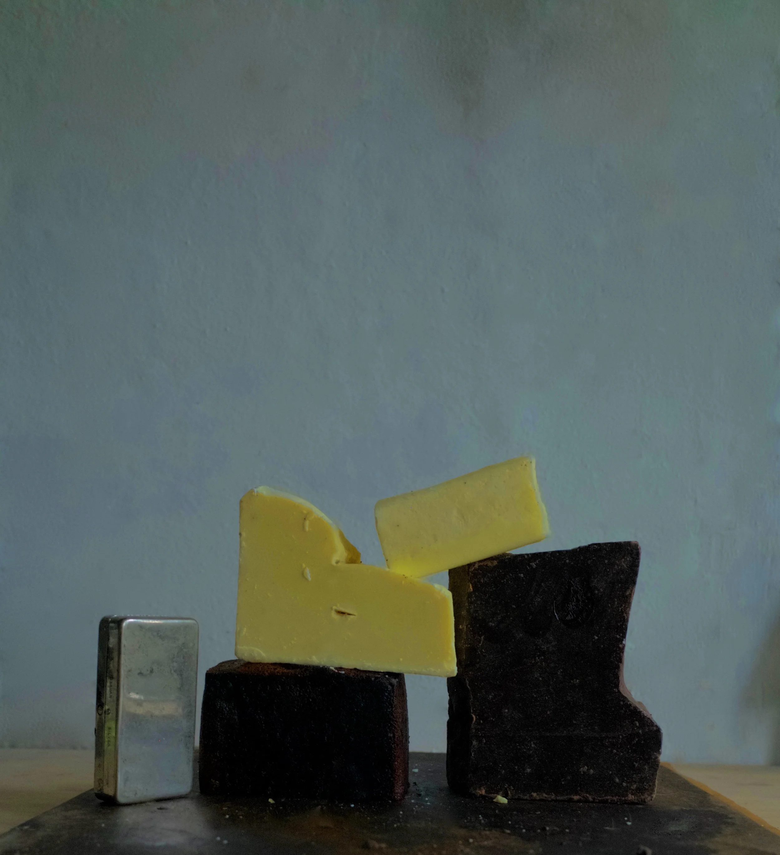
Some parts of my work seem to call out to other parts, but there are times I feel very fractured amongst it. However, I’m pretty sure it all bears my signature at this point. I think it’s all a bit “off.” It’s been many years of making work I wasn’t very proud of, and I’m finally at a place where I can stand behind it and feel it’s worth sharing. I guess that in itself means it is all in dialogue. Each of my subjects- headlines, conceptual food sculptures, drawings, etc.- work towards showing the underbelly of something, or take an initial concept and turn it a bit sideways, usually with a wink and a sneer. I do need to devote specific time to each subject on its own though- like a mama and her cubs. You know...they like playing together, but ultimately need to be shown individual love and affection in order to grow up without emotional complexes.
Images courtesy of the Artist
Lexie Smith
What to read next


